
Open most push notification dashboards and you get numbers. What you do not get is context. Is 22,000 clicks a good month? Not without knowing what last month was. Why did opt-ins jump in June? Nobody remembers. Are we running anything that goes out on repeat every Monday? You might have to go digging through a long list of scheduled, drafted and sent campaigns.
We have rebuilt the Aimtell dashboard around those three gaps. It looks considerably better too, but that is the least interesting part of it. Campaigns are now broken out by what they are actually doing, so every repeating campaign sits on a page of its own. Every headline number arrives with its trend against the previous period, so you can tell a good month from a bad one without opening anything. And any day on any chart can now hold a note, so the context lives beside the data instead of in somebody’s memory.
Here is what changed, and why each piece is there.
Find Any Campaign by What It Is Actually Doing
The old campaign list was one long list with a status column. That works at ten campaigns. At four hundred it means sorting, scanning, and squinting. And the question you usually have is not "show me everything," it is "what is going out this week" or "what did we leave half-finished."
So the statuses moved into the sidebar. Expand Manual Notifications, Triggered Notifications or RSS Notifications and each one now has its states underneath it, every one a real page with its own URL:
| Campaign type | Statuses you can jump straight to |
|---|---|
| Manual Notifications | Drafts, Scheduled, Repeating, Sent, Paused |
| Triggered Notifications | Drafts, Active |
| RSS Notifications | Drafts, Active |
Manual campaigns get the full five because a manual campaign genuinely moves through all of them: you write it, you schedule it, it either repeats or it sends, and you can pause it along the way. Triggered and RSS campaigns do not have a send date to be scheduled against; they are either live or they are not, so they get Drafts and Active. Matching the states to how each campaign type actually behaves seemed better than showing three empty pages for the sake of symmetry.
The everyday win is smaller than it sounds and more useful than it sounds. Each of those is a URL you can bookmark. "What is queued to go out" is a link. Drop it in your team chat on a Monday. Make Drafts your landing page if your job is finishing what other people started. And because status now lives in the navigation, we could take the status column off the list itself and give that width back to the things you actually read.
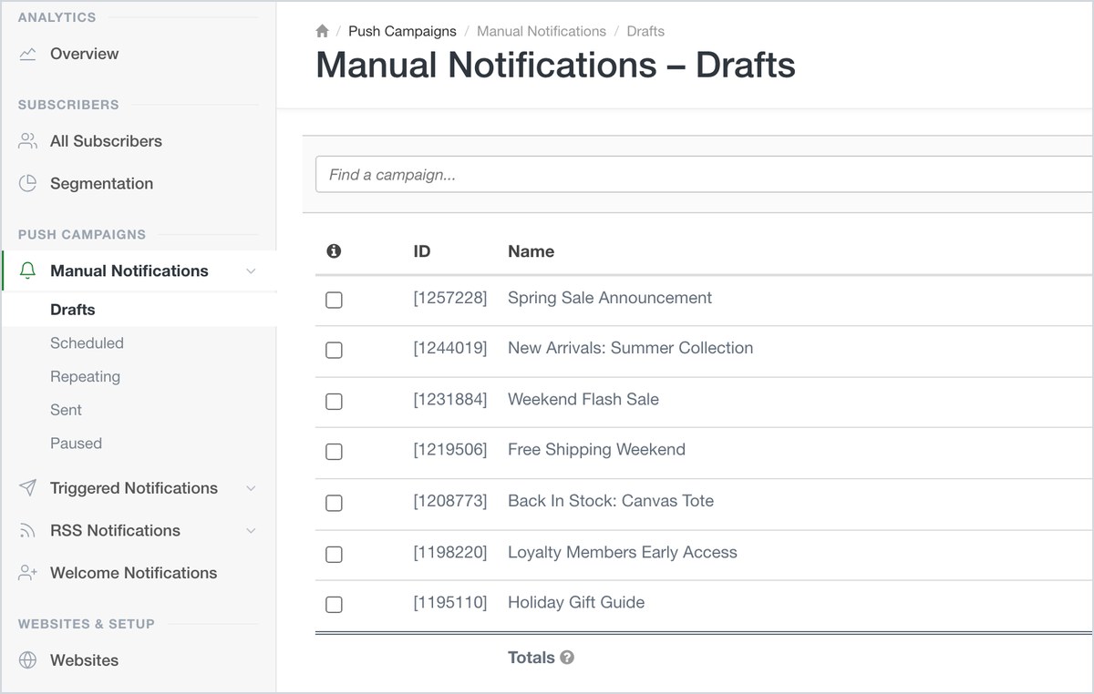
Each status is its own page, so “what is still in draft” is a link rather than a scroll.
The list pages got tidied up at the same time. All six of them (manual, triggered, RSS, segments, websites and subscribers) now share one toolbar row: search, the create button, Options, Columns, Dates and pagination, in the same order, in the same place. The old Active/Templates tab strip is gone, and every create button says Create Campaign rather than three different things depending on which page you were on.
Every Number Now Comes With Its Trend
A number on its own is not information. 22,778 notification clicks is meaningless until you know whether last month was 20,000 or 30,000.
The four callouts across the top of the analytics screen (New Subscribers, Notifications Sent, Notifications Clicked and Conversions Value) now each carry three things instead of one:
- The figure for whatever range you have selected.
- The change against the previous period of the same length, in green or red. Look at the last 30 days and it compares you to the 30 days before that. Switch to Last Quarter and the comparison moves with you.
- A sparkline of the trend, so you can tell a steady climb from a single spike that happens to land in the right place.
That third one matters more than it looks. A percentage can say "up 13%" whether you grew evenly all month or had one enormous Tuesday. The sparkline tells you which, before you have clicked anything.
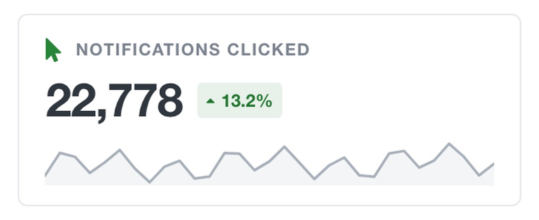
Every callout carries the figure, its change against the previous period of the same length, and the shape of how it got there.
And the callouts are now the way into the chart. Click any one of them and that report loads below, so the number that caught your eye and the chart that explains it are one click apart rather than two menus apart.
Notes: Write Down What Happened, While You Still Remember It
This is the feature we are most pleased with, and the one that is hardest to appreciate until the first time it saves you.
Every analytics chart has stories buried in it that the data cannot tell you. Opt-ins dropped 40% on a Tuesday in March. Was that a bad prompt change, or the day the site was down for four hours? Conversions doubled in a week in June. Was that the new segment, or the sale? You knew the answer at the time. Three months later, nobody does, and you end up reconstructing it from Slack history.
So you can now write notes directly onto the chart, on any day, on any report.
- Adding one: click a point on the chart. The note form opens on that date. Adjust the date if you need to, type what happened, and hit Save Note.
- Spotting one: any day with a note carries a small marker on the chart, and hovering it previews the note without leaving the page.
- Reading them: click the marker and the day opens, listing every note written against it.
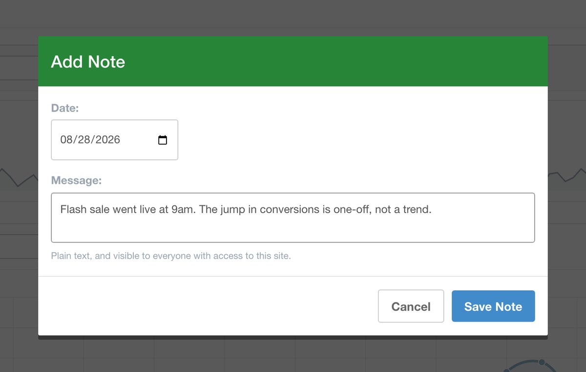
Click a day on the chart, write down what happened, and the whole team has it from then on.
Three details make it work as a team tool rather than a personal scratchpad:
- Notes are shared with everyone on the site. A note your developer writes about a deploy is visible to whoever is reading the numbers next week. This is the whole point: the context leaves one person's head and lands somewhere the team will look.
- Every note shows who wrote it. So "site migration, expect a dip" comes with a name attached, and you know who to ask.
- You can add as many notes to a day as you want. Big days usually have more than one cause. Your marketer notes the sale, your developer notes the deploy, and the day carries both.
Notes attach to the specific report you are on, not to the account in general, so a note about a prompt change lives on New Subscribers and a note about a broken checkout lives on Conversions, so each one sits where the person investigating that metric will actually run into it. Your own notes carry Edit and Delete links. And Aimtell's own account-wide announcements, such as platform maintenance or browser-level changes that affect delivery, appear in the same list, so the external causes and your internal ones sit side by side on the same day.
Two things worth knowing. Notes belong to a single site, so they are not shown while the site picker is set to all sites. And on a chart that has rolled up to weekly points, a note defaults to the first day of that week, with the date field there to move it to the exact day you mean.
The habit to build is a small one: whenever you do something that will show up in the numbers, whether that is shipping a prompt change, running a sale, migrating a domain or pausing a campaign, leave a note on the day. It takes ten seconds and it is worth an hour of archaeology later.
Coming Soon: Running Aimtell Through AI
One more thing, and this one is a genuine preview rather than a release.
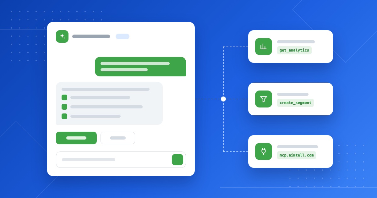
We are building AI into Aimtell in two directions. The first is an assistant inside the dashboard. Ask it what your best-performing campaign was last quarter, or have it build a segment from a description instead of a condition builder. The second is an Aimtell MCP server, which lets AI tools you already use connect directly to your Aimtell account and work with your campaigns, segments, subscribers and analytics on your behalf.
We are not putting a date on either yet. But the dashboard rebuild is what makes them possible, and they are close enough that it is worth telling you they are coming.
Take a Look
None of this changes how your campaigns send. Everything you had still works exactly as it did. This is the same platform, with the questions it can answer made a good deal easier to ask.
If you already have an account, it is live now. Log in, expand a campaign type in the sidebar, and go leave a note on something you will want to remember in three months. The full walkthrough is in our dashboard documentation.
Not with us yet? Start a free Aimtell trial, browse the full feature set, or get in touch and we will walk you through it.