A brief interactive message sent to a subscriber’s desktop (or mobile device), web push notifications are designed to increase traffic, jumpstart engagement, and re-capture visitors to a website, even when a user isn’t browsing it.
While popularized on mobile devices, the push notification has taken on a larger and larger role in websites. Just about every major browser has integrated them with their own platforms—Chrome, Firefox, and Safari—and for good reason. Simply put: web push notifications work.
Take eXtra Electronics, a consumer tech retailer that increased sales by 100% via web push notifications, or Japanese real estate site Suumo, who reported a impressive 31% open rate of their desktop notifications.
But the myriad benefits of web push can only be truly realized when the entire notification process (from subscribing to clicking) is optimized for the user experience, or UX. With poor UX design, these notifications go from a blessing to a curse, yielding disastrous results for your website.
To avoid these pitfalls, I’ve compiled this list of three common UX mistakes in web push notifications. These are mistakes that developers or site owners regularly make when employing web push. I’ve also provided remedies for these mistakes, which you can either implement yourself, or hire a UX design agency to fix for you.
1) Botching The Permission Request
Before we delve into optimizing the UX of the notification itself, it’s imperative to design your website so that users will actually opt to receive them. To achieve this, your website has to explicitly ask the user for permission to send push notifications.
This is where the first common UX flaw occurs: requesting permission from the user without clearly and concisely explaining the purpose of the notifications. Remember, users find unnecessary notifications annoying—if they’re not absolutely sure of what type of alerts they’ll be receiving, they’ll deny permission without a second thought.
The most egregious version of this gaffe is the “page-load” request, where the user is prompted to block or allow notifications from the site immediately after the page loads. This is poorly-designed UX because it offers zero context to the user.
What kind of notifications will they be receiving? How often? Why do they matter? A page-load request answers none of the questions a user will have, so they’ll simply opt out of receiving them.
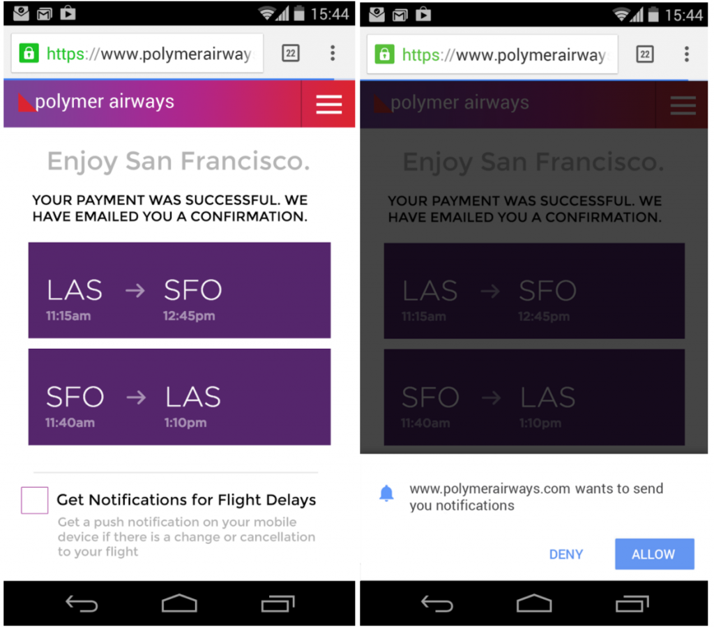
To ensure your site’s visitors will subscribe to web push notifications, provide context and offer clear explanations of what these notifications are. Look here at the UX-improved version of Polymer’s permission request:
In bold font, it immediately offers value to the user: “get notifications for flight delays.” It then gives a brief, but informative, elaboration underneath. Only when the user clicks the box does the formal request appear. Now the user knows exactly what this request is referring to, and they’re much more likely to select “allow.”
You’ll notice this example is for mobile push notifications, not web. But the principle transcends the medium: if you don’t provide an explicit, contextual permission request, you don’t reap the benefits of web push notifications.
2) Being Overly Wordy, Rambling, Lengthy, Long-Winded, Or Verbose
See what I did there?
To avoid obtrusiveness, most web push notifications are fairly small; they rely on movement, rather than size, to catch the user’s eye without interfering with whatever task they’re completing. Because of this, you have limited real estate to deliver the notification’s message.
Which brings us to the second major UX design flaw: being too verbose, or stuffing your notification with content. This is a mistake site designers make all the time, and not just in the realm of web push—nobody likes to read long paragraphs of text on an ecommerce site.
Here’s an example of a notification bogged down with information, most of it redundant:
This notification doesn’t need to say “heavy traffic expected Tuesday” twice—it gives them more to read for no reason whatsoever. Even if it’s just four extra words, you have to consider that many web push notifications are time sensitive, and could disappear before the user gets to relevant information.
Improved Version, with Redundancies Removed – (Source)
Another quick tip to keep your notifications concise: don’t inject additional advertisements into them, even if it’s for your mobile app, another service you provide, or anything extraneous to the actual message you’re delivering to the user.
You don’t need to include your website title or domain name either. Most browsers include this information by default in their notifications, and an appropriate icon should make it obvious to the user who is sending them this alert.
3) Being Too Vague
While it’s important to avoid verbosity, it’s also prudent to not overcompensate, and potentially err on the other side of the content spectrum. If your notification is too vague, the user won’t understand what it’s for, or why they should click on it.
Here’s a terribly vague example that may as well be a riddle instead of a web push notification. “New missive” is cryptic, and most likely completely meaningless to the average user. The “explanation” under it is even more half-hearted.
Your notification should present a clear message, and provide a call-to-action. Take another poor example:
Another Poorly Designed Web Push Notification – (Source)
First, the notification headline is vague—“Credit Card” could mean anything. A better headline would be a shortened version of the text underneath, that states “your credit card has been compromised.” A more fitting replacement for that text might be “Find out more information” or “Chat with an agent.”
Oftentimes, your notification needs to strike the right balance between informative and open-ended. It shouldn’t be so thorough that the user doesn’t need to visit your site, but it should provide value. Remember, the end goal is for the user to visit your website.
Putting It All Together
Web push notifications are a powerful tool for increasing conversion rates. They can provide customer value and boost engagement, even when users aren’t browsing your website. But when wielded improperly, without considering their UX design, they’re ineffective.
Whether you’re considering implementing web push notifications, or if your current campaign isn’t performing, consider enlisting a UX design company. With a UX-first strategy, you’re utilizing web push notifications at their maximum potential.
Wrapping UP
What UX techniques are you currently implementing? We want to hear! Share your story or alert us of some tips we forgot to mention by sending us a message.
Get started with web push notifications for free with Aimtell.
Tags:
digital marketing, ecommerce, ux mistakes, ux mistakes in web push notifications*, web push notifications.
Featured Guide
BEGINNERS GUIDE TO WEB PUSH NOTIFICATIONS
Download the beginners guide to Website Push Notifications and discover how you can re-engage your visitors and leads with one of the most powerful remarketing tools available!
FREE GUIDES
Comprehensive insights on using web push notifications to re-engage your audience.
Begin sending Push Notifications within minutesStart your free 14-day trial